
What’s in a Name?
 Jun 8, 2014
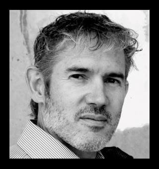
 The next time you raise a glass of your favourite beverage, you are likely toasting the artistry of Ian Brignell. The font and lettering designer has created logos for the biggest names in beverages, including Smirnoff, Captain Morgan, Tanqueray, Budweiser, Miller, Coors Light and Coke.
However, Brignell’s work is not limited to liquid refreshment products. He has made his mark on some of the most recognized brands in North America, including Bell, Duracell, Dove, Burger King, Harvey’s and Hershey’s, to name just a few.
With such a high profile roster of clients, Brignell can count many career highlights, but one of the most memorable was designing the font for Coca Cola’s Share-a-Coke campaign. “It was top secret. I did the job in two weeks having no idea what the lettering would be used for,” recalls Brignell. He found out a month later that he was designing a font for the personalized can promotion which was launched in 2011 and has since made its way around the world.
“It was a great feeling to see my work on a billboard in Paris when I was there this past summer.”
A 1982 Graphic Design graduate, Brignell caught his big break in 1995 when Estee Lauder hired him to create the logo for its perfume, pleasures. The freelance designer has since taken much delight in working on campaigns for several other iconic products that he remembers from his childhood, such as Caramilk, ChapStick and Aspirin. He now shares this excitement with his own children. “My two sons were so thrilled when I landed the Burger King job. They even presented me with ideas that I still have.”
Brignell still approaches each new assignment with a childlike eagerness. “I love the work – every project is like a present to unwrap or a puzzle to solve, explains the award-winning designer. “When dealing with big brands, you may not be able to change the design much, but there is often a segment of the market the client isn’t reaching. It’s my job to find subtle ways to make that happen, which is kind of exciting.”
But can an artist still be creative within such a narrow scope? Absolutely, says Brignell. “The trick is to embrace the limitations and be as creative as you possibly can. It’s a challenge but when you’re successful, it’s very satisfying.” In fact, working under these conditions can be harder than having a blank slate, he adds, “and it’s much more relevant in the marketplace.”
“I love the emotional effect letters can have – the memories they evoke and the mood they create.”
To help the creative juices flow more freely, Brignell can turn to his Sheridan training. “One of the best lessons I learned at Sheridan was quick figure drawing. Often it’s through these pencil sketches incorporating small gestures where you find the spark you need. This is what I’m trying to do in much of my work - to introduce a very subtle element into something that’s quite fixed.”
Coming to Sheridan directly from high school in Kanata, Ontario, Brignell clearly remembers those early college years. “As soon as I walked in the door at Sheridan, the atmosphere and the collaborative feel of the place just felt right.”
Today, after 32 years of designing lettering and fonts, Brignell has introduced his own online type foundry, IB Type Inc. In a way, it is a nod to his college days. Graphic design students have been calling for the artist to make his designs available in the retail font marketplace. Now, anyone can have a Brignell Typeface in his or her font library.
"I love the work - every project is like a present to unwrap or a puzzle to solve.”
Media Contact
For media inquiries, contact Sheridan’s Communications and Public Relations team.


